Category

Category
Client
Work
To update the existing graphs to make it easier for our clients to track performance and value of their investments and portfolios.
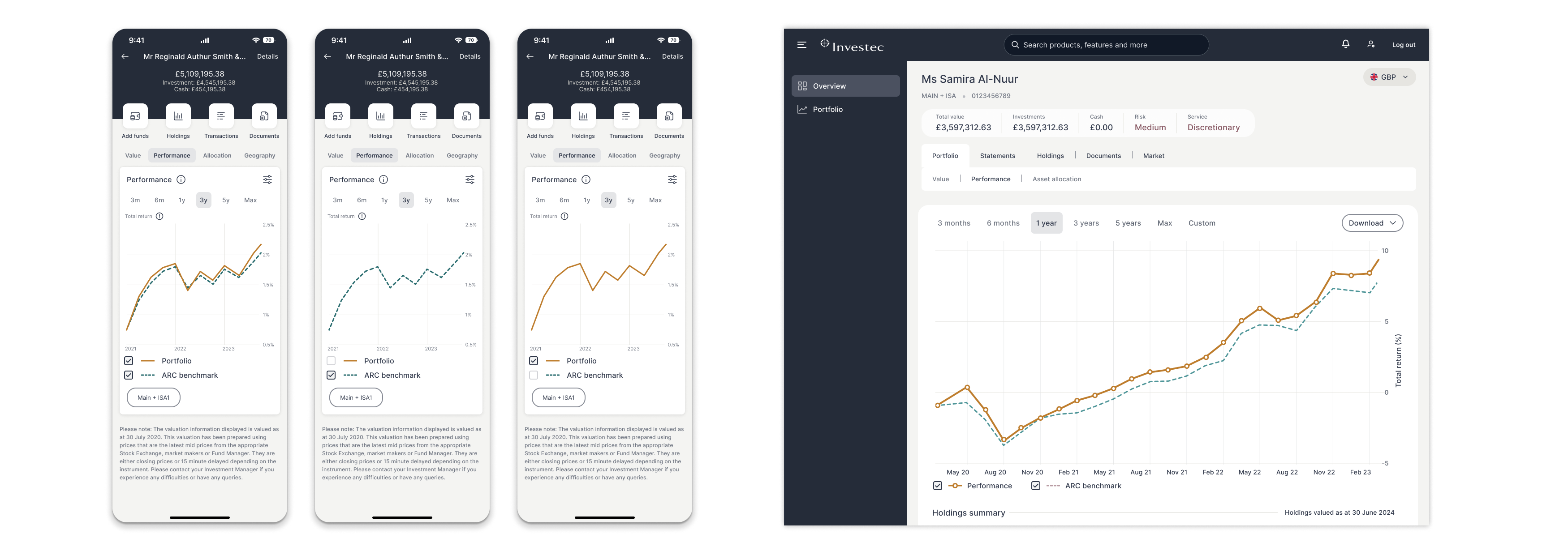
The graphs gave a very high level insight of the clients portfolio, value and performance.
Interviewing many clients it was clear that IW&I needed to give more clear and concise information.
I would like to see underlying value and performance net withdrawals.
The graphs used in the IW&I App and website were not user-friendly and lacked the ability to provide insightful information to the clients. This resulted in confusion and frustration as they relied on the graphs to make important decisions.
Solving the issues with the Performance and Value graphs was a much simpler task. I spent time with the developers and the data team to understand what data was required and how it could be used more effectively. This allowed me to show more data points and benchmarks.
I was able to add in more data including payments in and withdrawals as well as dividends.
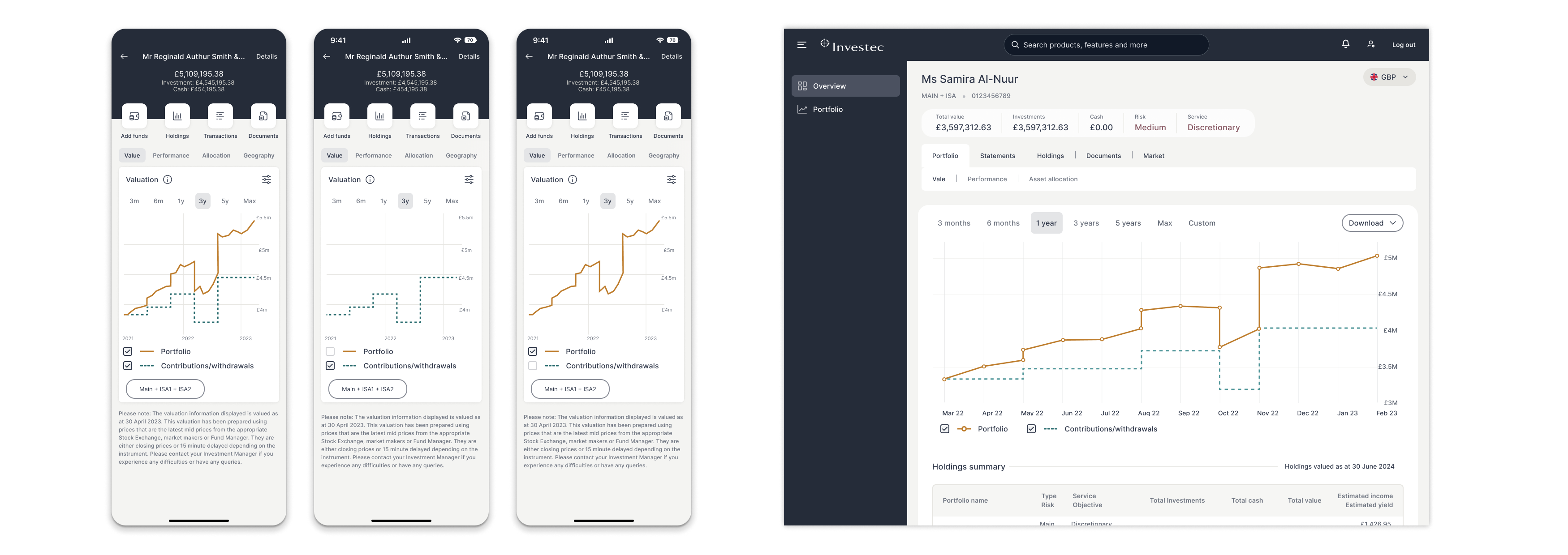
Having originally designed the graph to have a multitude of benchmarks to compare against, I built a prototype and carried out user testing with the clients. It became obvious that the benchmarks were too complicated and overwhelming. The answer was to replace these with our internal benchmark.
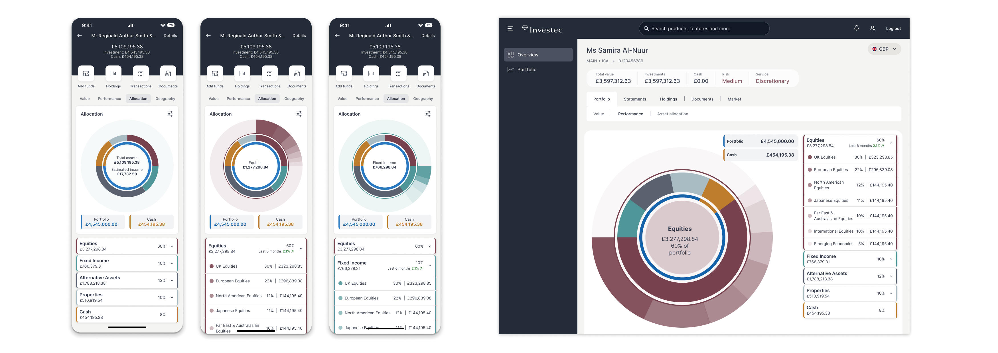
The original asset allocation doughnut graph had a hover with the amount and percentage, which did not give enough information.
The graph I designed allowed the client to see a more detailed breakdown of the assets allocation within the portfolio.